Magnolia
Logos
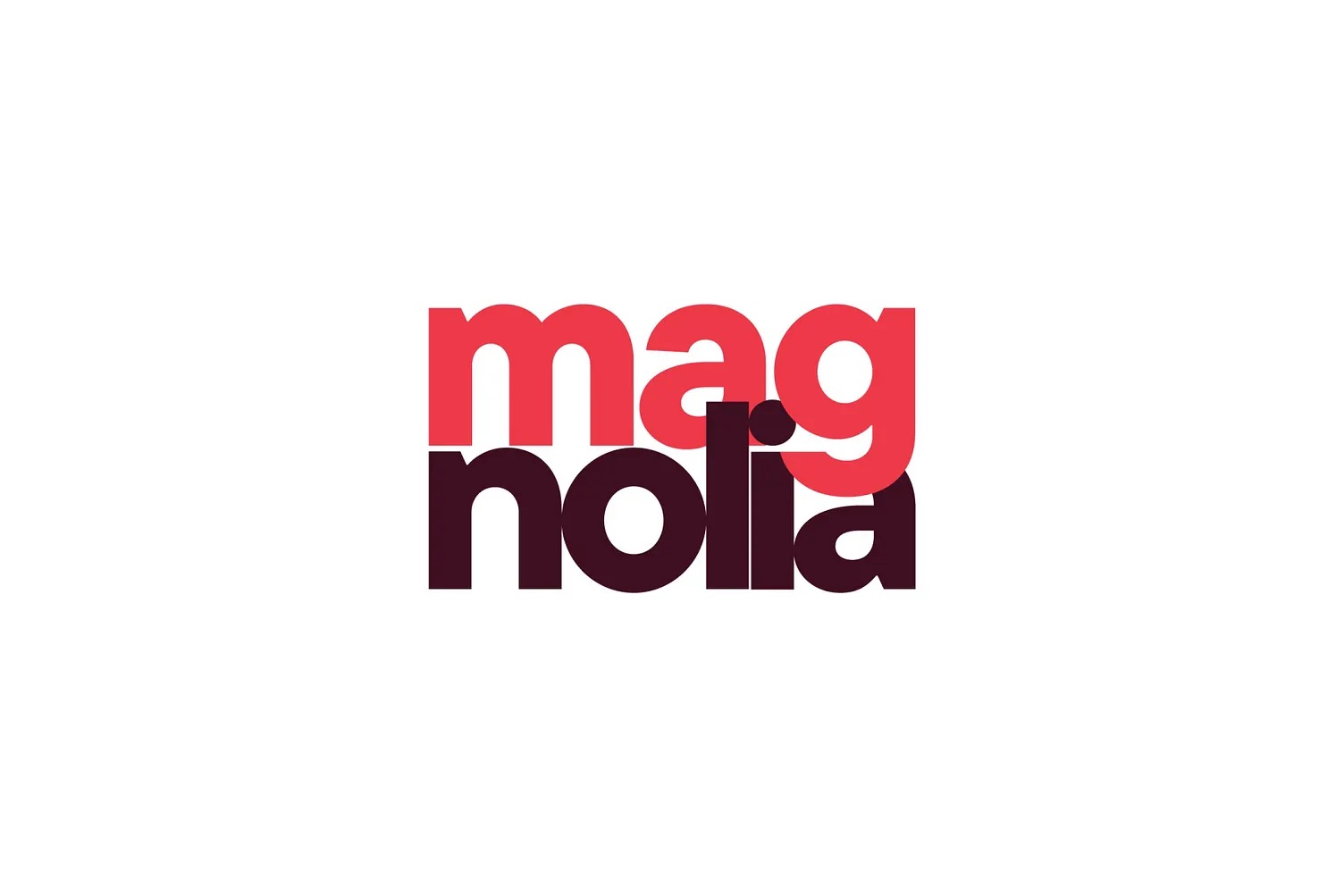
A personal logo I created a while back for a dear friend, Magdalena, who happens to love magnolias 🌸
The concept plays with the first three letters of her name, breaking and stacking them to create a bold, memorable typographic mark. The split composition (“mag” / “nolia”) subtly references magnolia, turning her nickname into a visual identity without being literal.
I kept the typography heavy and rounded to feel warm and confident, while the overlapping layout adds depth and a sense of personality. The color pairing — vibrant red and deep burgundy — reflects strength and softness at the same time, much like the magnolia flower itself.
Simple structure. Strong presence. A personal story behind the form.


